

Saturday, 28 December 2013
Sunday, 22 December 2013
Portfolio site
Friends and colleagues have been asking me for a portfolio of my UX work for quite a while. But with all the work I've been doing in the last couple of months that was really the last thing on my mind. I finally found some time in the last two weeks and made piotrbakker.com — simple one-page site with links to two PDFs: Portfolio and Resumé. Take a look for yourself, and don't hesitate to let me know what you think.

Wednesday, 18 December 2013
User Experience Goals
When you are getting started on a new product it may sometimes be hard to wrap your head around what to focus on in terms of user experience. Depending on the goals of your users and the goals of your business you will naturally set your priorities on different elements. But what should you focus on when you are just getting started: you are testing your product, your business goals are still developing and you are only beginning to get to know your users? A while ago I came across a blog post that had some insights about this. Here is a quick overview.
Wednesday, 27 November 2013
Mobile App Design - "ReferrED"
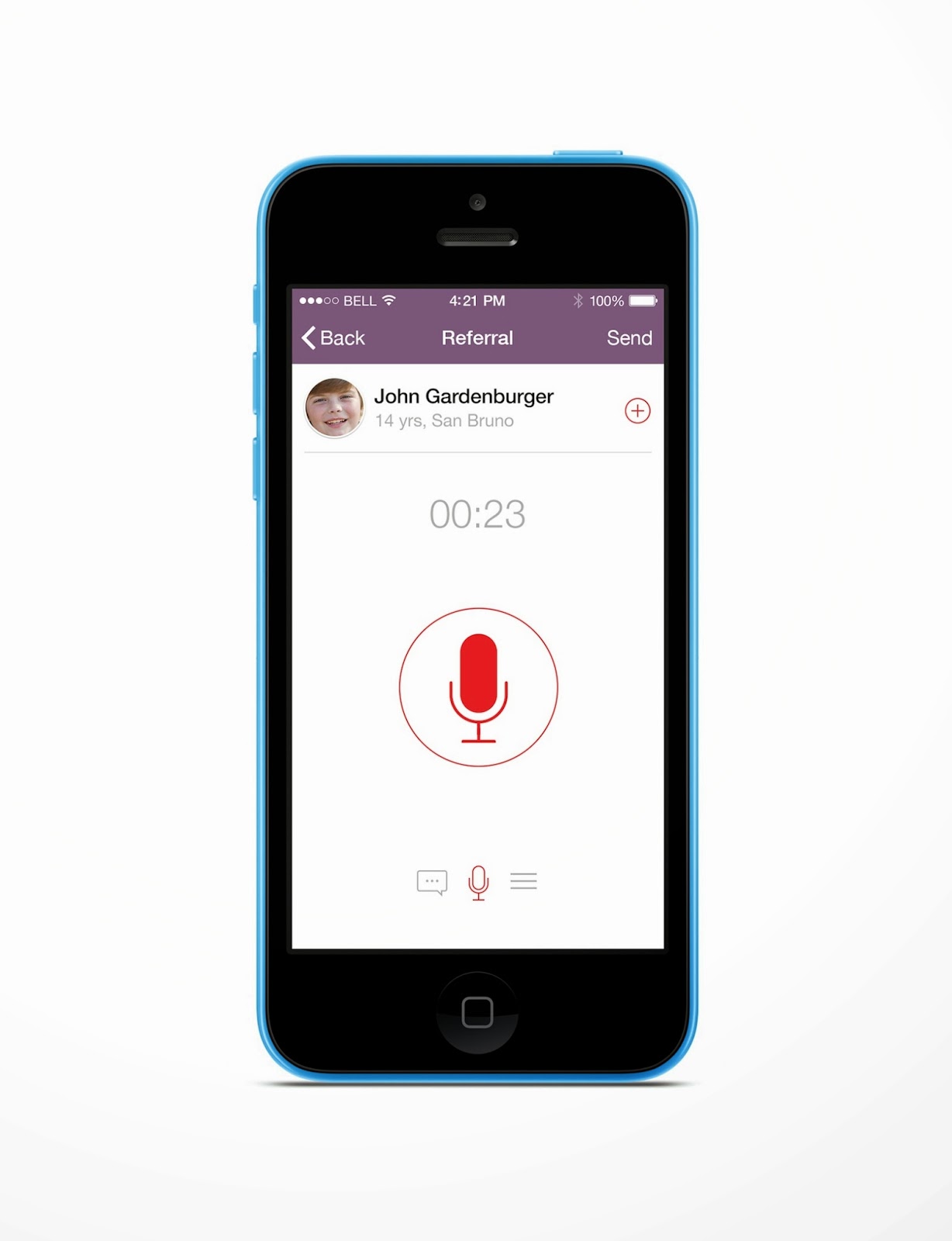
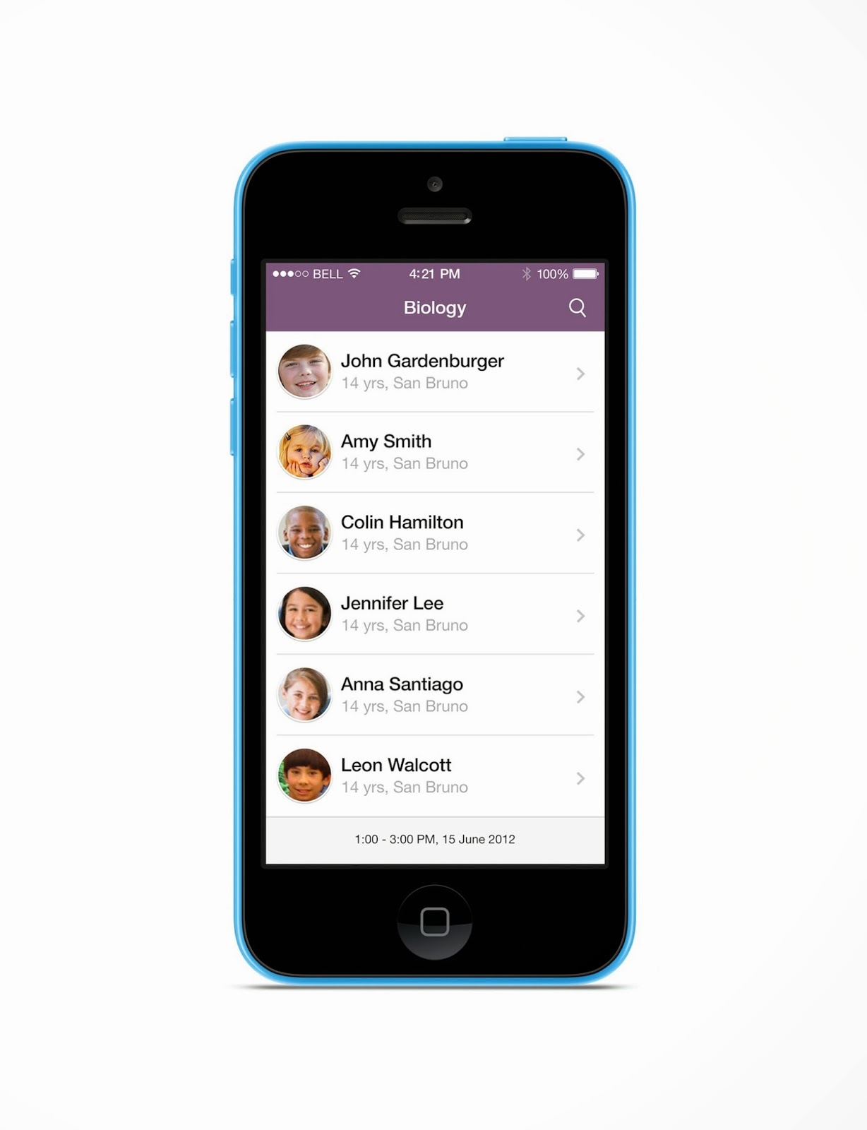
Last June I took part in a hackathon in San Francisco. It was called "Hacktivate ED" and it was 100% focused on solving problems in education. With my team we decided to tackle the issue of bad behaviour in class. We found out that a big problem nowadays is that there is a lot of paperwork involved in referring misbehaving students to the principal. This is distracting to the teacher and causes only more class time to be wasted. Because forms easily get lost the current process is also prone to breaking off valuable paper trail. In order to solve this problem together with my teammates we created an app that allows the teacher to easily capture what had happend and pass the info to the administration.
The app can tap into the school's scheduling / student data and use this contextual information to instantly tell what is the current class and list of present students. From the list of students the teacher then selects the culprit and gets to the referral screen. There the teacher adds either a voice or text message with the description of incident and sends it off to the school's admin via email. The admin receives the notification in the inbox and is able to follow up using the web portal which we also built. We called the app "ReferrED".
We worked on it for the full 24 hours and managed to get the prototype up and running literally just a few minutes before it was due. It was totally worth the hard work: not only did we win two awards in the hackathon but also met a whole lot of amazing people.
Below are my mockups of the user interface refreshed a bit today to reflect the changes brought in the meantime by iOS7.
Sunday, 3 November 2013
Presentation tools: past & future
I was searching for something on Dribbble the other day. For some reason their algorithms came up with an interesting suggestion from one of the users — Colin Miller. Colin made a series of illustrations depicting three different kinds of workspaces using only a single stroke line and a single background colour. I instantly liked his style. A couple of weeks later I went out for a run in the hills of Montara and all over a sudden had an idea. I thought about using this very same convention to show different presentation tools. I soon realised there was a pattern — each presentation tool was closely related to the era it was used in e.g., the blackboard in the "old days" or the whiteboard in office spaces of the 1980s. So the idea soon became "how presentation tools evolved over time". I thought it would help me explain how I see CooCoolu compared to other tools available on the market. It took me two days to finish but I enjoyed every moment of it. Here are the results.
Presentation tools: past & future

1830s

1980s
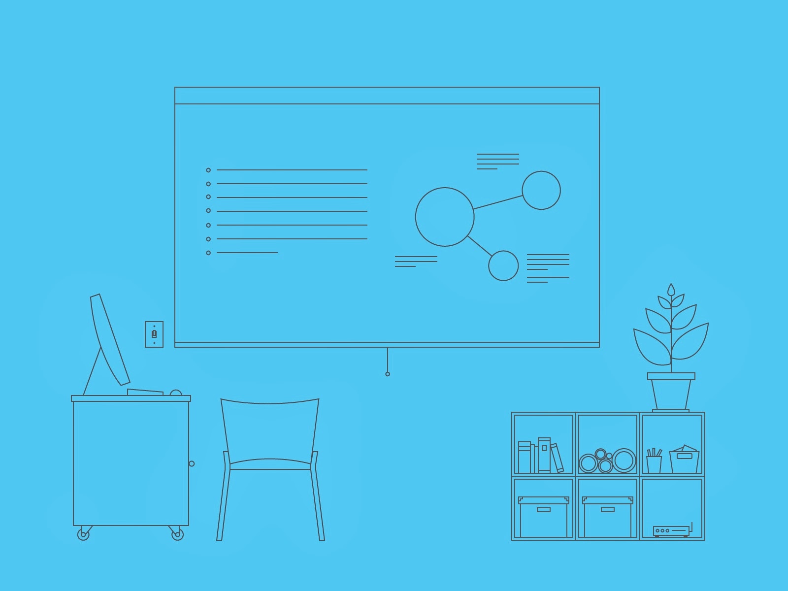
2000s

2014
Thursday, 15 August 2013
Preboarding

When designing apps very high up on the list of priorities is something that has, de facto, little to do with the product design itself, namely "onboarding". Onboarding is essentially the set of activities designed to teach the user how a given application works. It can take many forms, from static text descriptions to interactive tutorials taking the user by the hand and explaining the mechanics of the app step-by-step.
Onboarding is crucial for a number of reasons. First and foremost, it helps prevent situations where users abandon products only because they don’t know how to get started. Secondly, it sets a solid foundation for the user to get really good at using the product, and so become more satisfied and perhaps more immersed in the experience over time. Finally, having that kind of easy way for learning the basics of the product makes it so much straightforward for the user to get their job done—they don’t have to spend time figuring it all out by themselves.
But with every extra step we throw in front of the user before they get to play with the product the likelihood of a break-up increases. This is especially the case for mobile applications where automatization features, like auto-fill, are still lagging behind web browsers. That means that in some cases users may have a ton of work to do just to get started, even before proper onboarding begins. By adding more work still you would be seriously pushing your luck.
A different approach to this problem is to start teaching the user the mechanics of the product before the actual registration. It sounds more complicated than it actually is. One of the best examples is the DIY app from Zach Klein (founder of Vimeo). DIY is basically a social network letting kids showcase own creations and browse works of others. But unlike Facebook and Twitter you do not need an account to browse the content of the network or check out profiles of others. So by the time you are ready to post something yourself you will have already learnt how to use the app and know exactly what to do. It’s brilliant in its simplicity.
Pre-boarding, as I started calling this technique, is thus designing the product in such a way that the user starts to learn how the product works from the very second the app / site launches, rather than having to wait through registration and the like first. The way this can be achieved will depend on the type of product of course. For my own product coocoo.lu I’ve been working in the last couple of days on re-modeling the landing page akin to the way the actual product works. Instead of creating a wholly different experience I want to use the same layout and menu items contained in the product itself. I hope that once it's ready this will slice off a couple of inches off the onboarding to-do list. In the end it should also give coocoo.lu a more consistent look spanning the entire set of user touch points, including marketing and support, not just at the product level. This is a somewhat novel approach, to me at least, and I’m really excited about its potential. It would help solve a major headache for me. Hopefully, it’s not that novel that will require a tutorial of its own.
Thursday, 31 January 2013
Weary climber
 |
| Der Chasseur im Walde Caspar David Friedrich |
On a steep mountain slope,
Lone climber struggles to the peak
He's holding to his rope,
But his grip begins to creak.
Strained by its barbed rock
Worn by whips and scorns
His rope now nothing but a stalk
that’s bearing piercing thorns.
Lost and without hope
To conquer this perilous wall
He’s ready to uncoil his rope
And let the abyss take control.
It never was his intention
To leave this world like this
But if this means redemption,
Temptation is too hard to resist.
His life shall be forgotten
His name ceasing to exist
His flesh and bones rotten
Soul dissolved in the mist.
He takes his final breath
Slowly unclenching both fists
But doubting this precipitous death
Does not cease to persist.
He looks up to the stars—
Why not climb out of this deadly pit?
Though he might not move very far
He might move at least a bit.
How much work it took,
Those that are already gone?
How would the world look
If they too, chose not to carry on?
Wednesday, 9 January 2013
Oasis of peace
 |
| Claude Monet Canal in Amsterdam |
Right inside in the middle
Of the oasis of peace
Where even the hardest riddle
Feels like a goodbye with a kiss
In a kaleidoscope of yellow
Sweet bitter tastes of gold
Where every goodbye leads to a new hello
Where you feel young even when you're old.
Here I float without end
In the glow of green serpentines
And every moment here that I spend
Feels like in the middle of my dreams.
Subscribe to:
Posts (Atom)