Monday 28 April 2014

Hungry Shrimp

Recently I took a weekend off to work on a little side project. It was a 2D web-based game, loosely based on Space Invaders. I've never designed a game before so it was a fun challenge. I enjoyed the experience. Building a game has this element that you can do whatever you imagine, there are no boundaries; you can let your creativity run wild. Afterwards I realised it had quite some effect on me and even wrote about it on Medium. Funny how good things can come from the most unexpected places.  

You can check it out at hungryshrimp.com


Thursday 27 March 2014

Web Design for Wearables

Last week's announcement of the Android Wear OS got me curious about how the design of the typical websites we come across every day would have to adjust to work on a smartwatch. I was thinking especially in the context of responsive design. I explored a couple of ideas and sketched different possibilities. It usually unearths some interesting solutions. Here is a couple of such sketches which I came up with during that session. I simplified it on purpose, as I was playing with the ideas for the most part. I won't go into details here but if you would like to read more about it I also wrote a post on Medium, which gives more nuanced overview of the design rationale. Please feel free to check it out there and share your feedback and thoughts—https://medium.com/ux-ui-design/eaf3a5522cae.


Services we use while out and about.


A cool web-app that a friend told you to check out. 


Context-based content.


Sunday 19 January 2014

Lean Logo Design — Visual Portmanteaus

Creating a logo from scratch can be a daunting task if you are not a trained graphic designer. But there is a technique you can use to get around this problem — I call it "visual portmanteaus". Portmanteaus are combinations of two different words which together form an entirely new word, all while retaining their original meanings. Microsoft, Groupon and Pinterest are well known examples of this. You can create a logo using this method as well, only difference being that instead of combining words you combine pictograms. 

What you do is try to come up with pairs of objects that would represent the brand. Once you have a shortlist you search the web for pictograms / icons representing those objects (ideally in .svg format). You can use resources such as IcoMoon and NounProject, which offer very cheap / free images. Pictograms are by definition somewhat generic and on their own don't always make good branding assets, but combining two or more pictograms into one can yield surprisingly unique effects. 

Take a look at the three mini case studies of some of my recent logo designs (each completed in under 1 hour). The cases first introduce the product and then break down the rationale behind the design decisions. Of course, there is a lot more to creating brand identity than throwing in such a visual portmanteau. The typeface and the colour are equally important. So I briefly describe the rationale behind these choices as well.


Gobsmag


Gobsmag is a portmanteau of "gobsmacked" and "magazine". It's a recently launched online magazine that aims to introduce its readers to amazing bands they never heard of.

Pictogram
A vinyl record which also is a bomb, symbolising an explosion and an impact, similarly to when you are “gobsmacked”. At the same time the burning fuse can be seen as a broadcast antenna which reflects that gobsmag is a publication.

Derivative work of "Bomb" by Diego Naive and "Record" by Max Thorson, licensed under CC BY 3.0

Logotype
Helvetica Regular presents a certain level of sophistication, to appeal to the 30+ audience which I thought the target market would be. With its thicker lines it also matches the weight of the pictogram nicely. Lower-case gives the letters a more rounded look, again fitting well with the pictogram. 

Colours
Both letters and the pictogram are in black to disguise the pictogram as an actual letter and create a perception of a single entity. I wanted the reader to view the symbolic part behind the pictogram (music with impact) as integral to the brand.  

UX Tailor


UX Tailor is a brand name I came up with on a flight from San Francisco to Amsterdam. It's a user experience design agency that creates highly personalised designs, akin to being "tailor made". 

Pictogram
A pair of scissors symbolizes the craft of tailoring. The scissors sit in a "hollow" square is an icon YouTube uses for the full-screen mode, representing, thus, a holistic approach to design. 

Derivative work of "Scissors" by Edward Boatman, licensed under CC BY 3.0

Logotype
Open Sans is such a charming font that it's hard not to like it. It's very modern and clean, therefore I felt it would fit with the "blueprint" styling of the site which evokes innovation and precision. 

Colours
Light blue background refers to a blueprint, alluding to the technical aspects of user experience design. The scissors in dark yellow helps them stand out, breaking somewhat the white-blue colour scheme. In addition, drawing on the comparison with fire this colour evokes a certain level of fervour and urgency.


Quillio


Quillio is a mash up of Longman Dictionary and Penguin Classics APIs – inspiring writers through defining and displaying words in the context of classic novels rather than just a boring definition.

Pictogram
It combines a quill (feather) with an open book. The quill stands for the act of writing, while the book can be interpreted as a dictionary. Result: dictionary for writers. 

Logotype
Myriad is less popular than Helvetica, although there are some heavyweights using it, like Rolls-Royce and Apple. This gives it a slightly more unique feel. In contrast to Helvetica it also seems less formal, owing perhaps to an element of playfulness that is present in its curves.     

Colours
Greyscale at 40% gives it a neutral feel without drawing users’ attention away from the content. It's just enough to feel solid without screaming for attention. 


Friday 17 January 2014

UX Design Portfolio Template — Keynote Theme

For freelance UX designers keeping a polished showcase of recent work should be the standard. But between all the networking, administration and actual design there is often little time left for grooming your portfolio, let alone setting one up. 

Taking shortcuts like hosting sample work in a public Dropbox folder doesn't really cut it because it's cumbersome for hiring managers to browse through. A better option is to use Behance, which helps you tell the story behind each project. Still, for showcasing certain nuances of your work, especially user research, usability analyses or prototyping, setting up a standalone document might simply be unavoidable.

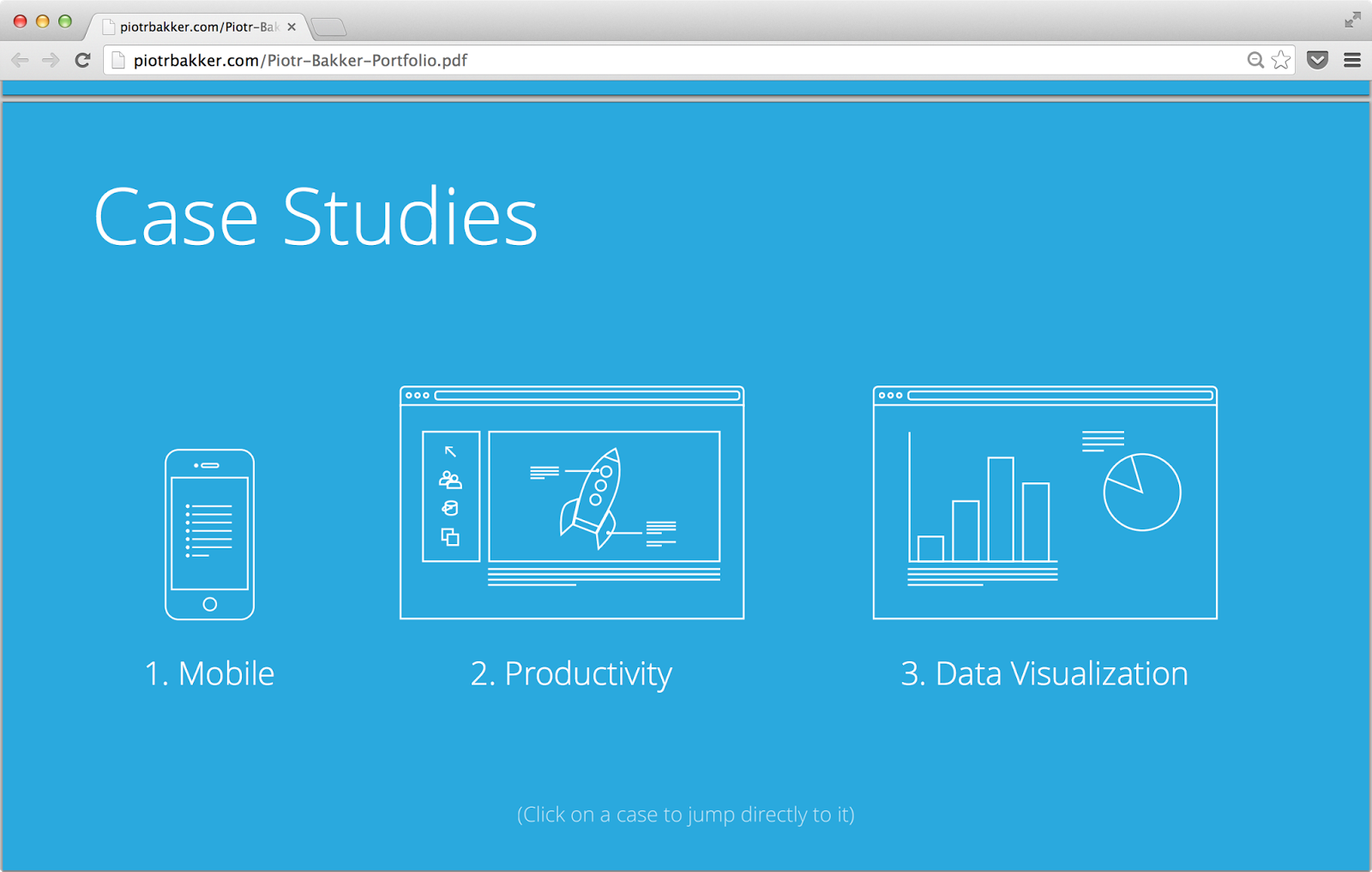
So here is a small giveaway that I hope will come in handy. It's a Keynote theme that I use for my own freelance portfolio. It uses a case-study format, with dedicated introduction and case-detail pages, for telling the story behind your projects exactly the way you want it. If you are just getting started or haven't had the time to set your portfolio up or don't know where to start, then this file should prove useful.

Key features:


– 6 master slides → simply drag&drop text and images
– Case-study format → dedicated case introduction and detail pages 
– Pictograms of UX design tasks and devices (hi-dpi) → guides the reader to the right content
– Resolution of 1920x1080 → display on an HDTV

To install this theme use the custom theme feature in Keynote. Open the file in Keynote and then go to File>Save Theme... to add it to your theme library. Click on the download button below to get it now.


Download


Inside of the UX Portfolio Template


Six ready-made slides

Customizable masters

Easy access through theme picker

Thursday 2 January 2014

Different Facets of UX Design


User Research


Usability Analysis


Information Architecture

Interaction Design


Visual Design


Sunday 22 December 2013

Portfolio site

Friends and colleagues have been asking me for a portfolio of my UX work for quite a while. But with all the work I've been doing in the last couple of months that was really the last thing on my mind. I finally found some time in the last two weeks and made piotrbakker.com — simple one-page site with links to two PDFs: Portfolio and Resumé. Take a look for yourself, and don't hesitate to let me know what you think.  


Wednesday 18 December 2013

User Experience Goals

When you are getting started on a new product it may sometimes be hard to wrap your head around what to focus on in terms of user experience. Depending on the goals of your users and the goals of your business you will naturally set your priorities on different elements. But what should you focus on when you are just getting started: you are testing your product, your business goals are still developing and you are only beginning to get to know your users? A while ago I came across a blog post that had some insights about this. Here is a quick overview.


Wednesday 27 November 2013

Mobile App Design - "ReferrED"

Last June I took part in a hackathon in San Francisco. It was called "Hacktivate ED" and it was 100% focused on solving problems in education. With my team we decided to tackle the issue of bad behaviour in class. We found out that a big problem nowadays is that there is a lot of paperwork involved in referring misbehaving students to the principal. This is distracting to the teacher and causes only more class time to be wasted. Because forms easily get lost the current process is also prone to breaking off valuable paper trail. In order to solve this problem together with my teammates we created an app that allows the teacher to easily capture what had happend and pass the info to the administration.

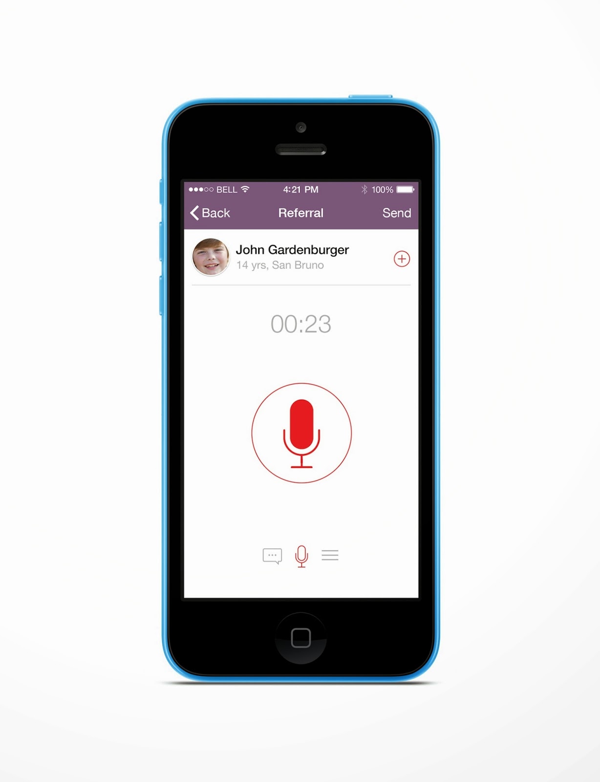
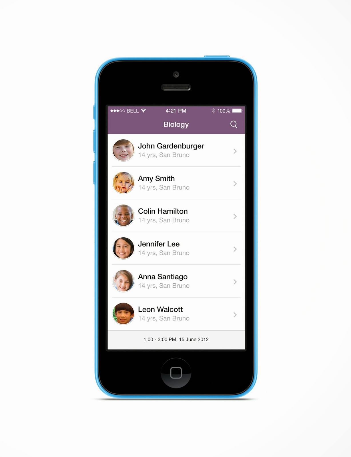
The app can tap into the school's scheduling / student data and use this contextual information to instantly tell what is the current class and list of present students. From the list of students the teacher then selects the culprit and gets to the referral screen. There the teacher adds either a voice or text message with the description of incident and sends it off to the school's admin via email. The admin receives the notification in the inbox and is able to follow up using the web portal which we also built. We called the app "ReferrED".

We worked on it for the full 24 hours and managed to get the prototype up and running literally just a few minutes before it was due. It was totally worth the hard work: not only did we win two awards in the hackathon but also met a whole lot of amazing people.

Below are my mockups of the user interface refreshed a bit today to reflect the changes brought in the meantime by iOS7.


Sunday 3 November 2013

Presentation tools: past & future

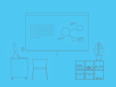
I was searching for something on Dribbble the other day. For some reason their algorithms came up with an interesting suggestion from one of the users — Colin Miller. Colin made a series of illustrations depicting three different kinds of workspaces using only a single stroke line and a single background colour. I instantly liked his style. A couple of weeks later I went out for a run in the hills of Montara and all over a sudden had an idea. I thought about using this very same convention to show different presentation tools. I soon realised there was a pattern — each presentation tool was closely related to the era it was used in e.g., the blackboard in the "old days" or the whiteboard in office spaces of the 1980s. So the idea soon became "how presentation tools evolved over time". I thought it would help me explain how I see CooCoolu compared to other tools available on the market. It took me two days to finish but I enjoyed every moment of it. Here are the results.

Presentation tools: past & future

1830s

1980s

2000s

2014